Dienstag, 31. März 2015

Prima BAP march

...got it ready just in time: my entry for the Prima BAP march challenge. I really enjoyed playing with that sketch.


 details...


Supplies: white cardstock, papers from sunrise sunset collection, Prima color bloom sprays (soft teal, empress gold), white gesso, black gesso, Finnabair art basics modeling paste, Prima elements stencil "lace", Prima clear stamp "messy", silks (solar gold), word sticker (simple stories), black and teal thread

Sonntag, 29. März 2015

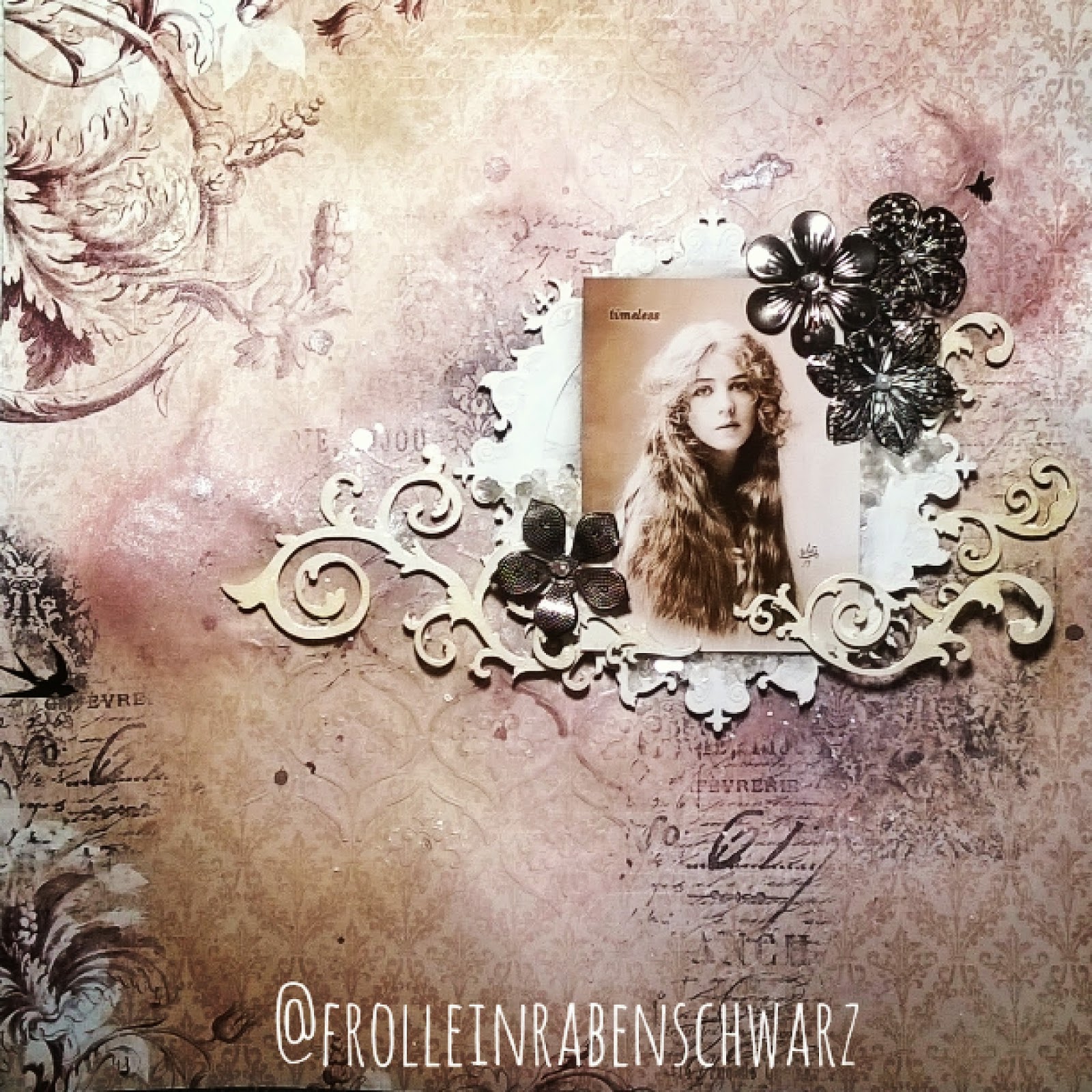
timeless


...besides all the gardening stuff and other things we have to get done in the backyard, I found some time to create this layout, today. It´s a sample I did for the shop I´m working at, using beautiful BoBunny paper, stickable stencils and wooden shapes as well as some metal flowers.


some details


Supplies: BoBunny paper (Rose Café collection), stickable stencil, wooden shapes, metal flowers, Prima mica flakes, Prima modeling paste, white gesso, Lindy´s Stamp Gang sprays (bodacious blush & clam bake beige), Ranger crackle accents, Tim Holtz rubons & background stamps, Copic opaque white, watercolor pencil

Have a great sunday!

Samstag, 28. März 2015

PPP march with photo tutorial

Today I´d like to share with you a photo tutorial on how I made this soft bridal Layout for the current Prima Product Pick challenge


Ok, so grab a cup of tea (or coffee) and lets get started...


 1. On a white piece of cardstock that I roughly primed with white gesso earlier, I applied a moderate layer of modeling paste through a floral stencil and gave it a good drying time with a heat tool. Then I played with Color Bloom sprays and water without going too wild. Let it dry again.


 2. While the page is drying I also put some spray on the flowers to match them with the color scheme. In the next step I assembled some paper scraps in order to prepare a nice layered background for the photo.


 3. Before adhering the paper collage to the layout I spread some white thread underneath. Now it´s time to add the photo and some more paper pieces on top.


 4. A small arrangement was also added to the upper right corner of the page. Now it´s time to arrange all the shiny flowers.


 5. To add some more bling and detail I chose black beads and frosted mica flakes here and there with acrylic matte medium.


 6. I spritzed some white spray dots with Lindys Stamp Gang "frosted Jack Frost" but decided it didn´t pop out as much as I wanted. So I grabbed a nearly forgotten "oldie": Copic opaque white which worked perfectly. The title is written and cut out by hand. Et voilà, we´re ready.


I hope you enjoyed this little step through and maybe you feel inspired to get creative as well. 

If you have any further questions, please let me know via the comment section.

Donnerstag, 26. März 2015

put on a happy face

A motivational page just for me.


Here are a few closer shots to show some detail


~ I love those guys ~


Supplies: white gesso, modelling paste, background stamps (Tim Holtz), moth stamp (Prima), "3 in a round" stamp (Stampotique), Lindys Stamp Gang sprays (black orchid silver, sweet violet purple teal), stencil (TCW), black thread, modeling paste


Next time I´ll provide some work in progress shots, too.

Mittwoch, 25. März 2015

If you can dream it...

...you can do it.

A new art journal entry. Of course, you know that feeling when you get new art supplies (in this case a flourish stencil) and you just have to play with them.


To emphasize different areas I grabbed some Prismacolor pencils in matching colors - it´s true magic and adds so much to the page.


Supplies: scraps of patterned paper, acrylic matte medium, modeling gel with iridescent glitter, flourish stencil (Scrapberries), white gesso, Prima color bloom sprays (iris & deep teal), Prismacolor pencils


Sonntag, 22. März 2015

Sakura art journal page

Today I´d like to share with you an art journal page I created for Creative Gym #6 at Mixed Media Place. This month challenge is all about typography. 


What can I say...I love writing and especially handlettering since I was young. So it was quite natural that I wanted to incorporate that into whatever I was going to do. 
I decided to create an art journal page with a slightly changed quote I found on Instagram. The bold Font is inspired by the smaller Tim Holtz rubons you can see on the transfered image. To give a certain balance to the bold black letters, I chose soft colors and a cherry blossom image transfer to go with it. The kanji in the upper right corner means sakura (cherry blossom).

"we constantly worry about what might happen in the future that we forget to slow down and enjoy the present."

Materials used: white Gesso, Schmincke acrylic medium "matte", Mikron pen,  Marabu stencil, Lndiys Stamp Gang spray "pretty in pink pink" & "jack frost", Prima Color Bloom spray "lime wedge", Prisma Color drawing pensils, graphite pencil, fixative


Samstag, 21. März 2015

*NEU*

hui, mein erster Blogeintrag seit langem...

...ich weiß gar nicht richtig wie ich anfangen soll.

Vieles ist passiert in den vergangenen Monaten. Viel richtig schönes aber leider auch einiges was mir ziemlich den Boden unter den Füßen weggerissen hat. Dank vieler lieber Menschen, die mir immer wieder Halt gegeben haben, bin ich aber - denke ich -  dennoch an diesen Schicksalsschlägen gewachsen und kann doch irgendwie wieder vorran gehen.

Der neue Blog gehört zu diesem Neuanfang gewissermaßen auch dazu. Es fühlt sich für mich einfach nicht richtig an, das Schreiben an dem alten Blog einfach wieder aufzunehmen. Dennoch bleibt er als inaktiver Blog über mein Profil weiter erreichbar.

Jetzt muss ich es mir hier ersteinmal noch etwas gemütlicher machen und dann gibt´s auch bald was zu sehen - versprochen.

Seid lieb gegrüßt,
eure Anja